SEEING CLEARLY IN THE Dark
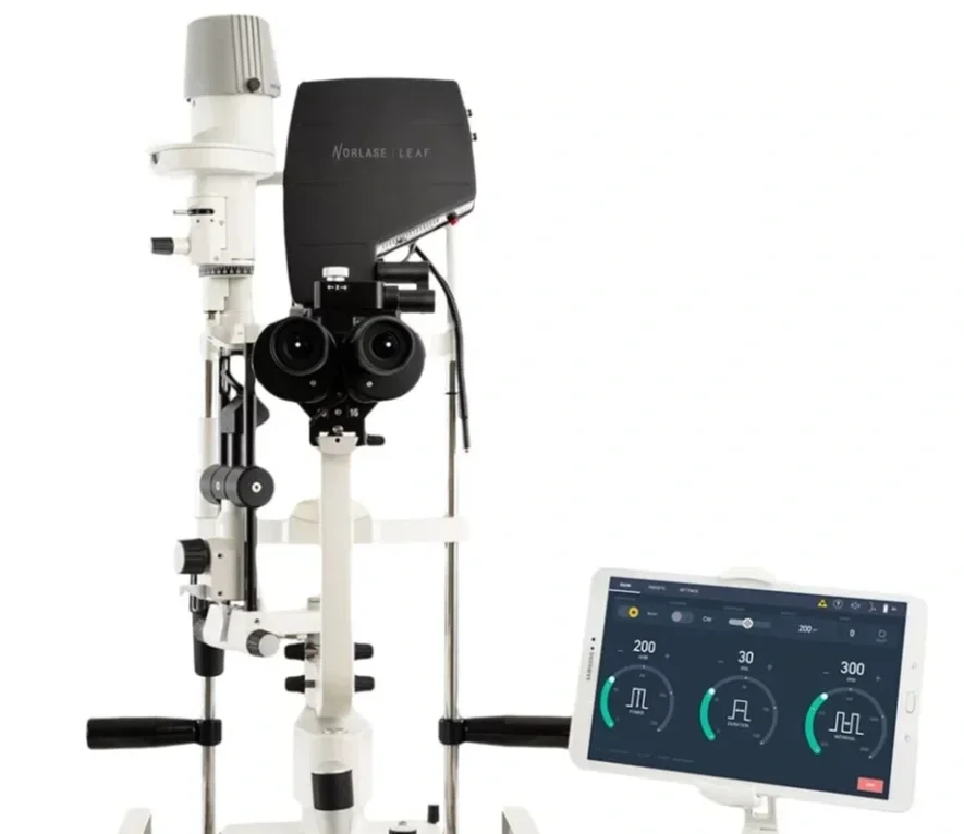
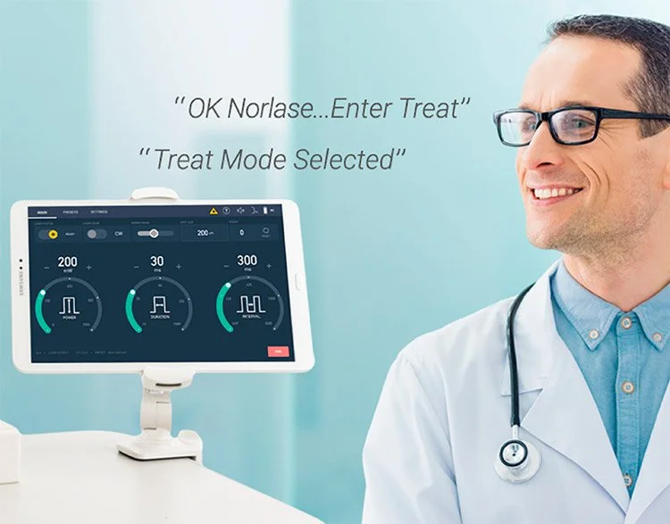
By introducing a dark mode graphic user interface, distinctive iconography, and hands-off controls with voice control, this graphic user interface refined user workflow of laser eye treatment and procedures.
Team
1 UI/UX Designer
1 Software Engineer
1 Product Manager
My role
UI/UX Designer
Impact
Wireless tablet enabled by UI and voice controls for in-procedure functionality
Timeframe
1.5 years
PROJECT
From seed stage to production, I was the lead UI/UX designer working alongside a product manger and software engineer at 219 Design. We built a GUI to introduce a digital screen to interact with an analog optic medical device.
Challenges our team faced during the design process included environment factors, building features for a new technical practice introduced to the optometry community, and integrating a voice-activated user interface.
SKILLSET
Brainstorm & Ideation | Interviews & Research | Workflows | Sketches | Wireframes | High-fidelity Mock-ups | Prototype & User testing
PROCESS
This was a highly iterative and cross-functional process where I spent the initial 4 months collecting and presenting in-field research to inform iterative design solutions. I tested my UI prototypes with a diverse set of users before launching the product to market to revise the UX experience and iconography elements based on feedback and critique.
I focused on:
Market Research
UI elements & information architecture
Functional testing
RESEARCH & ANALYSIS
Market research and competitive analysis of similar systems informed my initial brainstorms. User behaviors, critique, feedback, and common use cases were identified through in-person observations and interviews with our clientele. We defined information architecture of our UI, prioritizing primary functions that would occur during a procedure and distinguished them from secondary commands that may happen before or after a procedure has started.
Personas were created for power users as well as for those who would be less familiar with functionality but more familiar with power user workflows. We identified where the two user journeys would interact, and designed an experience that empowered both users to navigate efficiently and easily visualize actions to quickly execute their main purpose with the console.
USER INTERVIEWS & OBSERVATION
I visited observed users in their environments to document competitor systems and identify pain points.
KEY PAIN POINT
The dark environment of an operation room and cumbersome wires impeded their ability to quickly set up. Upgrading our system to a wireless tablet alongside implementing UI accessibility standards for impaired vision were our top priority.
WORKFLOWS
I built and revised clinical workflows utilizing data from user interviews and observations.
Our goal was to address the needs and use cases of the practitioner user, as well as potential teammates who may not be familiar with surgical procedures, but are crucial to the set up and support of completing a procedural task.
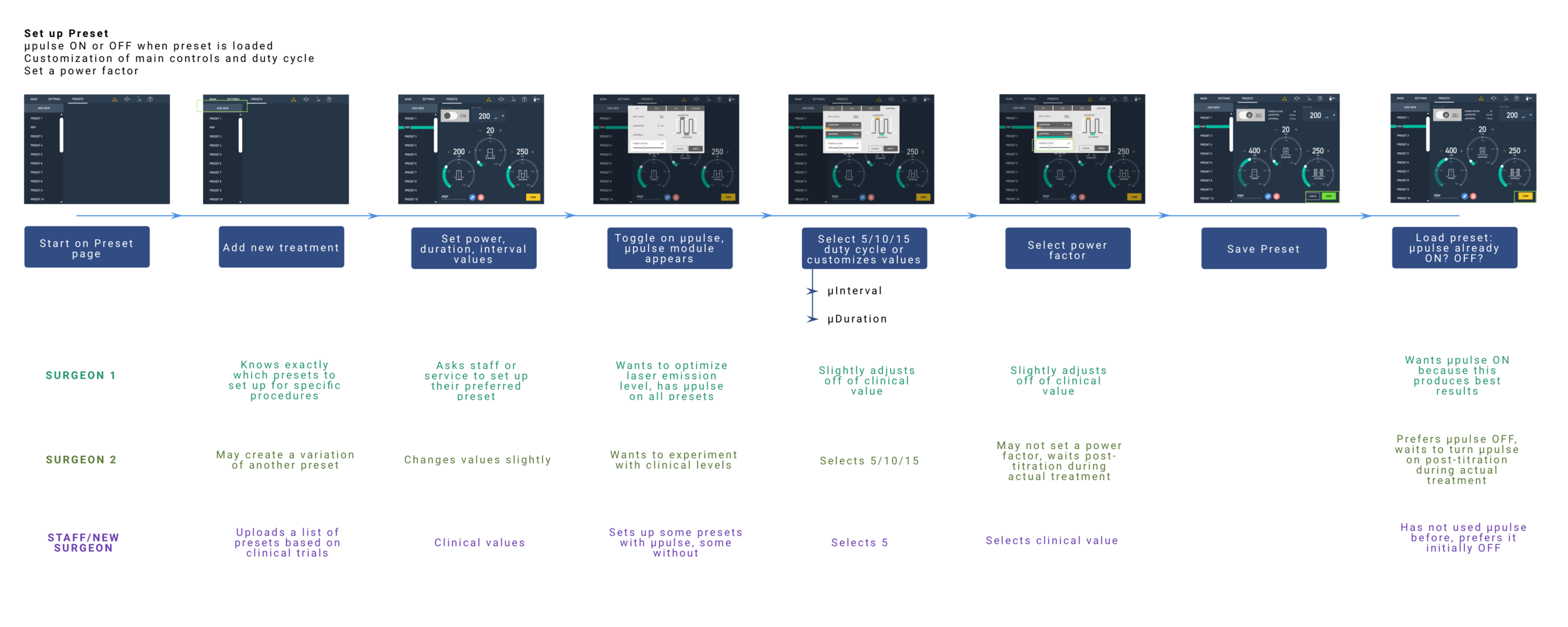
Img 5.
DESIGN ITERATIONS: FROM LOW TO HIGH
Data suggested that users found most current GUIs difficult to navigate and cluttered. Our goal was to alleviate complexity in the UI, by suggesting the largest elements on the page to be the primary actions and functions that were interacted with.
UI interactions that strayed too far from the original physical controls were heavily pushed back on because the learning curve felt too high. Our UI mimicked the physical set-up of older systems to utilize current user behaviors and muscle memory. Familiar iconography and visuals cues were simplified and enlarged for readability and legibility.
We found that higher contrast colors following Web Content Accessibility Guidelines, improved user interaction times by 67%.
PROTOTYPE TESTING
From paper prototypes to simulations in software, feedback during all stages of the prototype led to the refinement of information architecture.
Testing our tablet in-person revealed jarring page changes and clunky interactions. On our high fidelity prototype, we refined the fluidity of interactive elements and color contrast, testing various element shadows, color contrast, and notification prompts to distinguish visual hierarchies.
Voice command allowed our users to be hand-free and eyes focused on treating correct anatomy.
Voice-controlled UI elements brought a new challenge to our design process where we had to make adjustments to the responsiveness of our tablet based on pitch, tone, and volume of voice. I tested different commands and UI responsiveness based on a diverse set of data points.
A screen recording of one of the final prototypes that was tested with users and refined over the course of the project.
RESULTS
Observational studies and testing of our dark-theme color scheme GUI, resulted in a laser photocoagulator that allows ophthalmologists to set-up and perform their procedures in any exam room. Features like saving commonly used laser settings, voice controls to make ad-hoc adjustments, and a wireless tablet on the machine contributed to the user set-up time increasing efficiency by 85%.
Next steps and future findings to collect data on voice-control responsiveness and it’s impact on improved treatment outcomes could inform GUI and product offerings in future iterations.