
informative design for confident self service
Designed Genomic Life's first digital self-service platform from scratch turning a phone-call-only service into a self-serve experience members could use to order kits and manage their benefits on their own.
DEVICES
Desktop, Tablet & Mobile
TIME FRAME
6 months to first launch
MY ROLE
I led the entire design process, research, persona and journey mapping, wireframes, prototyping, and usability testing as the sole designer on the team.
MY ROLE
1 Product Designer
TEAM
1 Product Manager
2 Engineers
1 Client Services Manager
The problem
Genomic Life and Cancer Guardian services ran almost entirely through phone calls. Members were onboarded via census file imports and found the service mostly through word of mouth. There was no self-service option, no consistent onboarding, and members often didn't understand what the service actually offered. Educational outreach (webinars, email) was getting lost to spam filters and inconsistent messaging. Genomic Life needed a digital front door.
GOAL & SOLUTION
Direct new members and legacy inactive members to a digital self-service platform. A one stop shop to access their services through simple and easy experiences.
User Journey evaluation
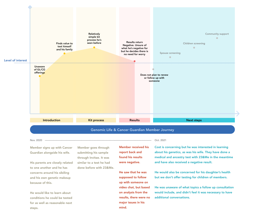
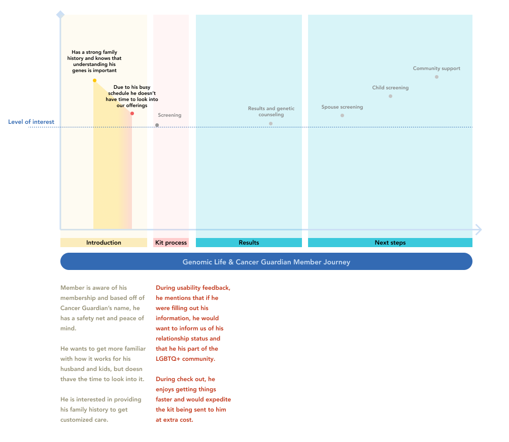
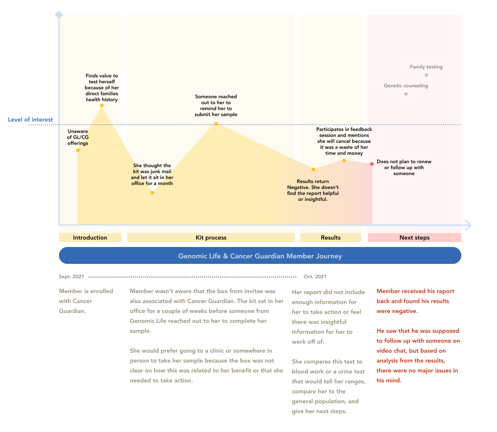
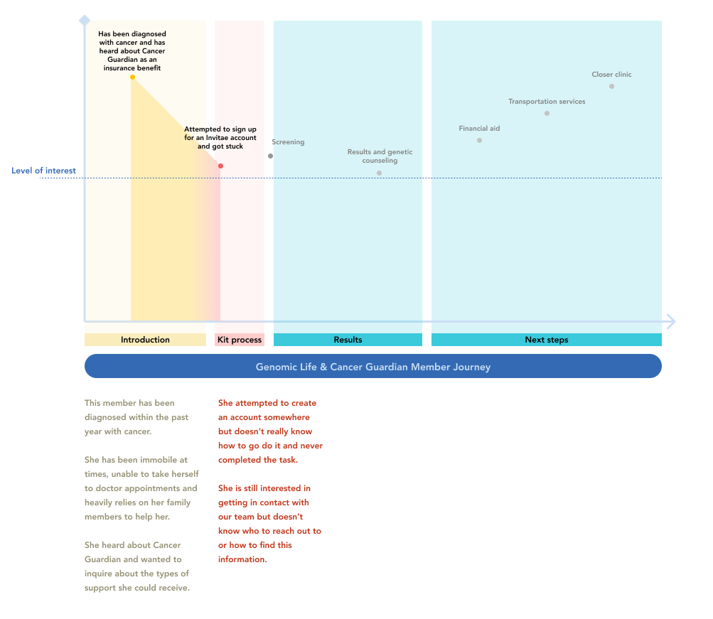
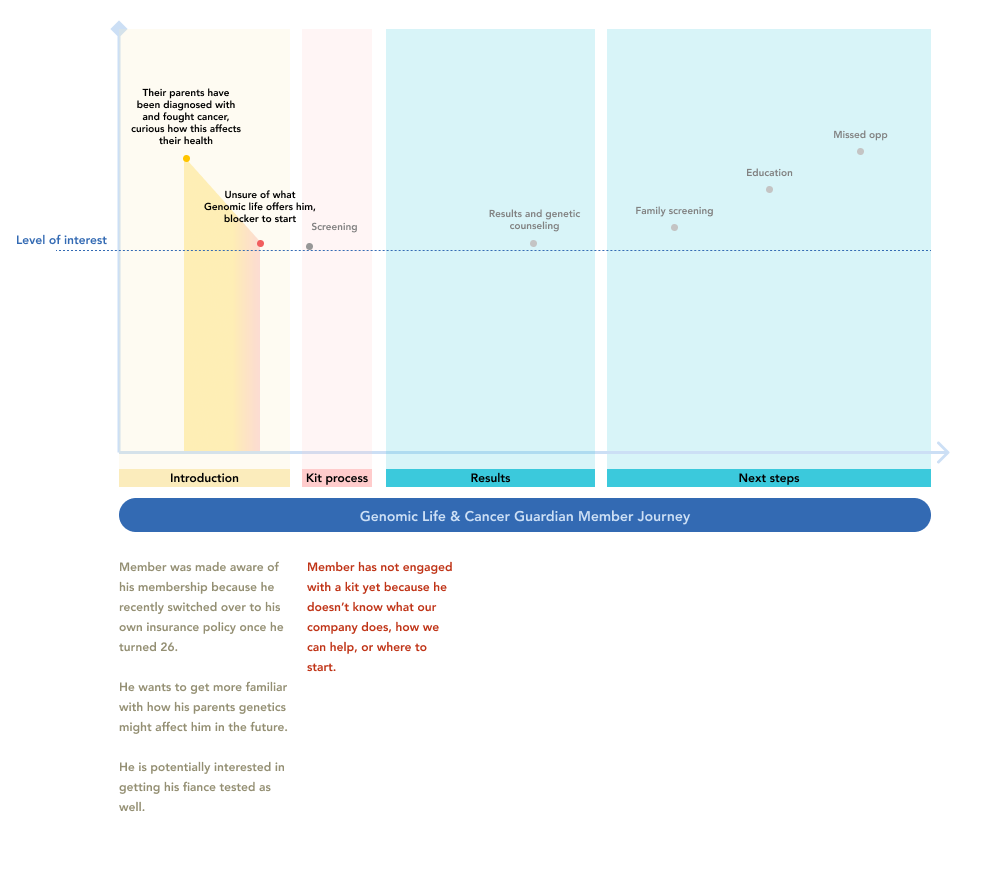
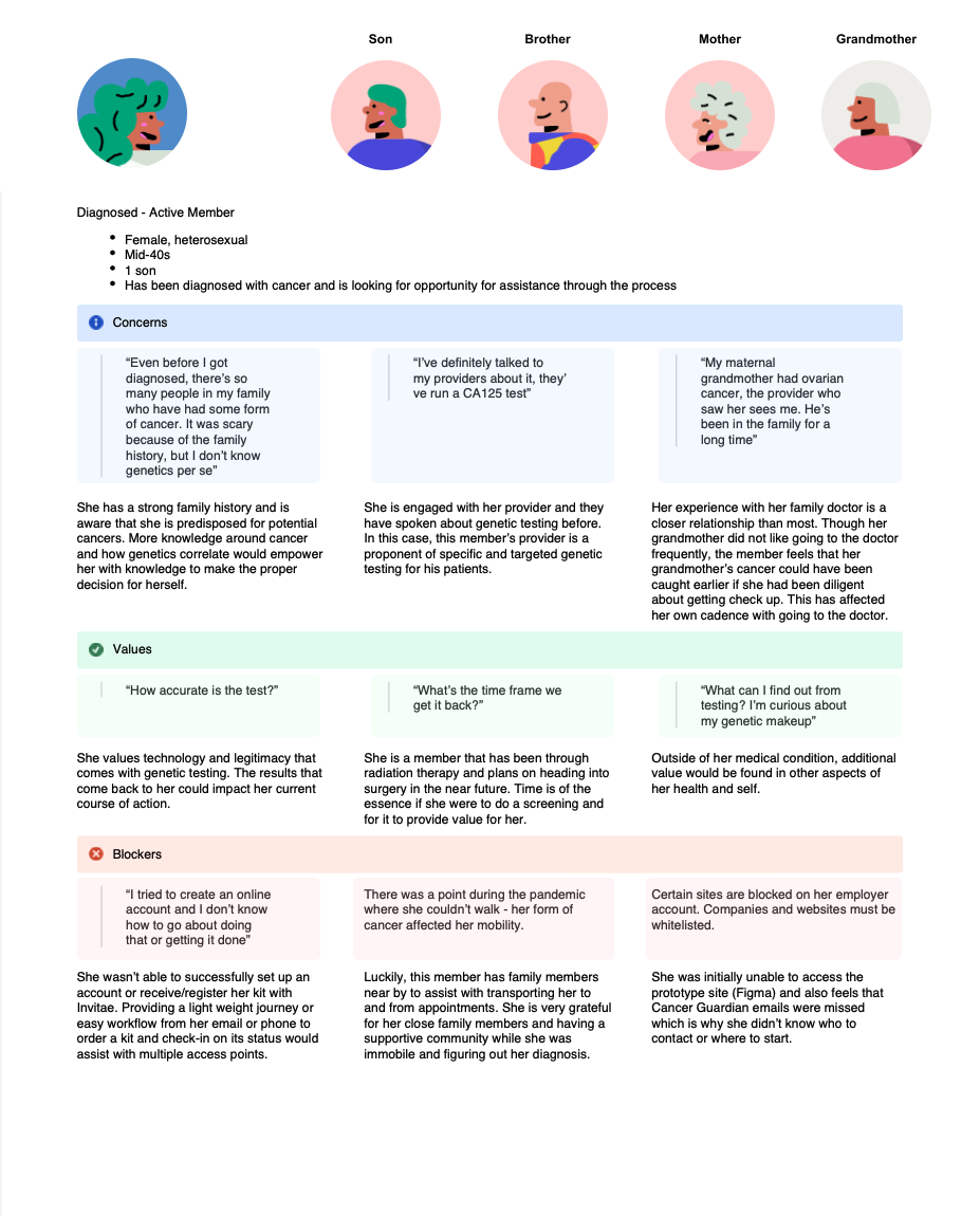
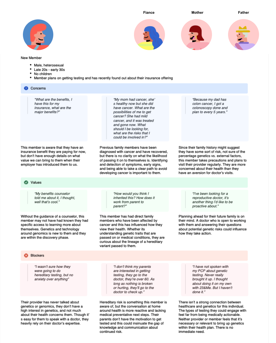
As the only designer, I started by mapping the current experience through the eyes of five distinct member personas, built from NPS open-text responses, screener surveys, and direct interviews. Layering these journeys against each other surfaced the friction points members had in common. The most urgent problems to solve first:
Kit ordering
Service transparency
Personas
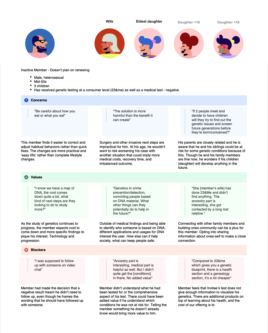
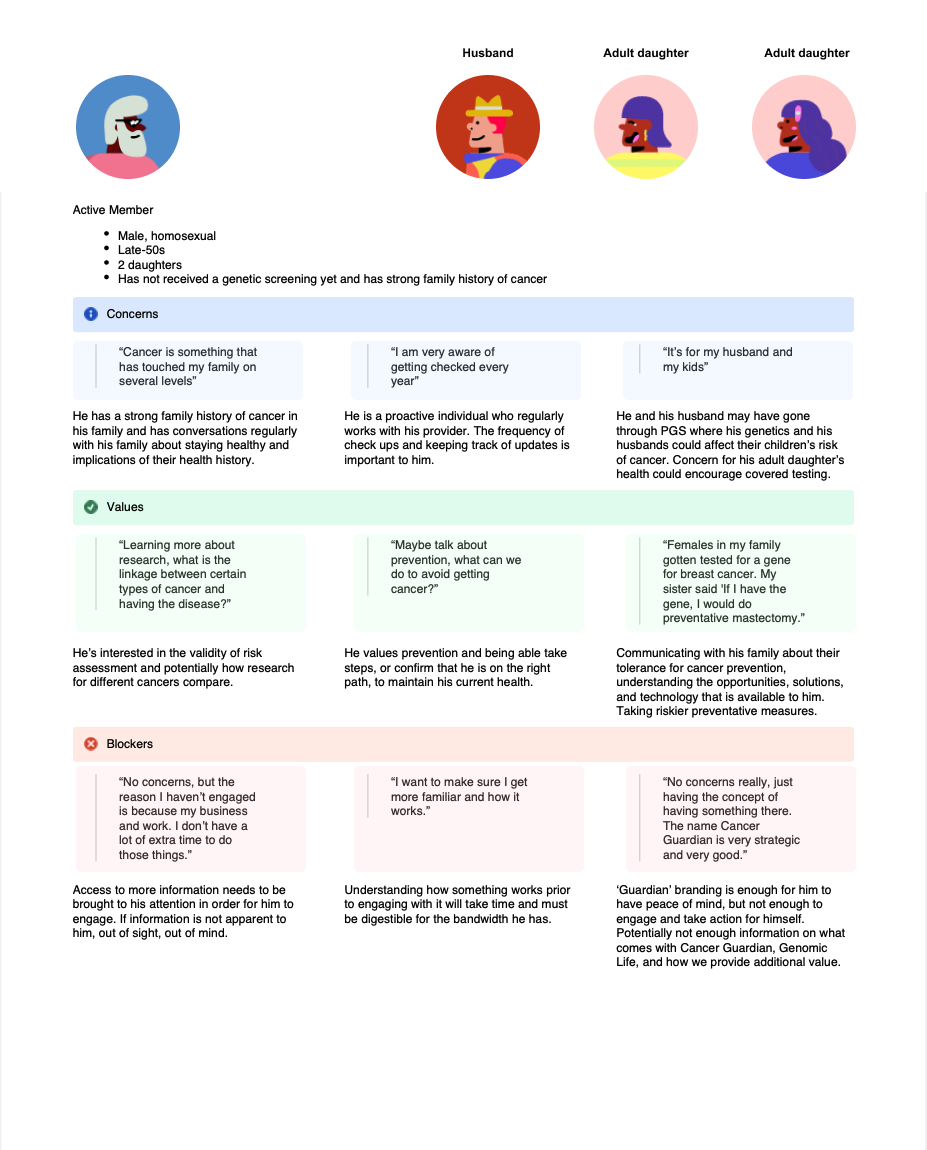
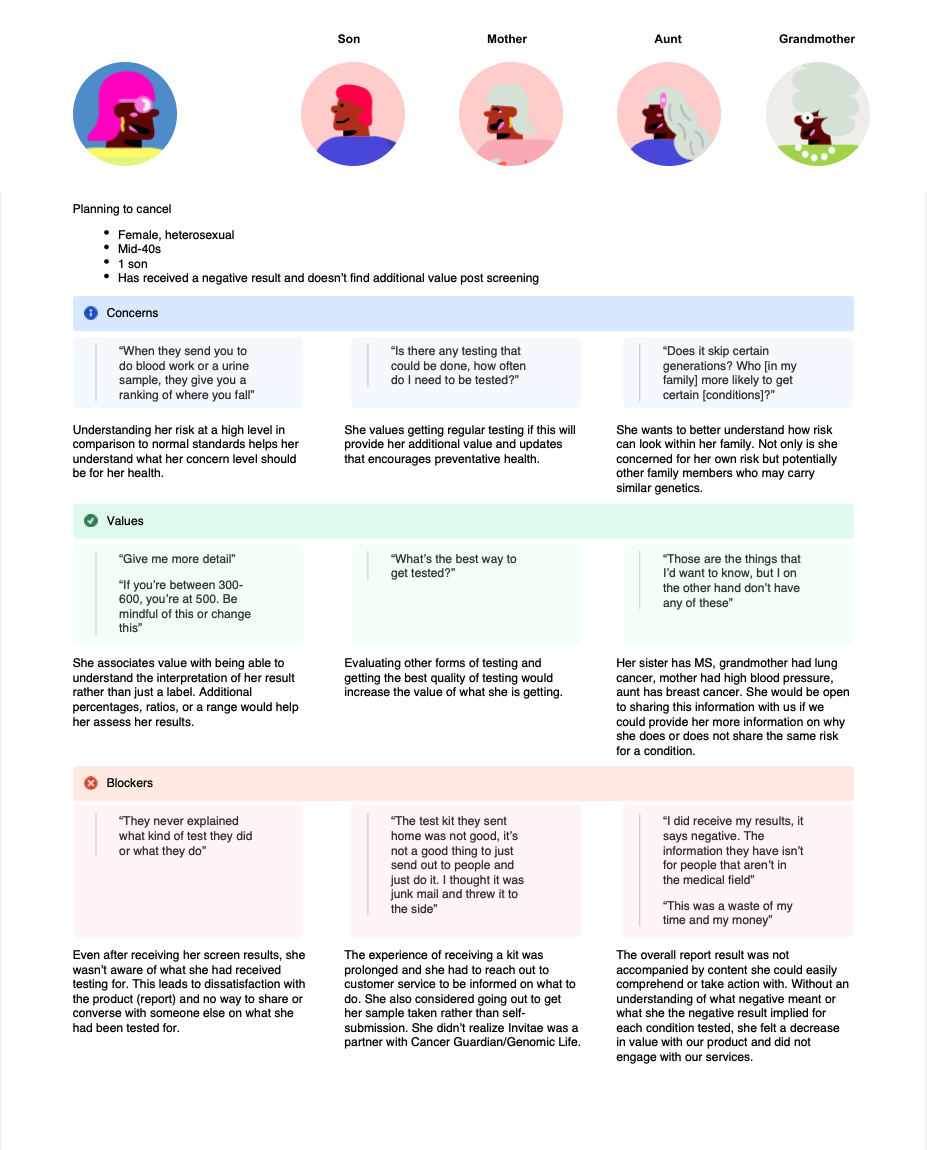
I created our various user personas to organize interview quotes and valuable insights that built empathy towards our users. Understanding their current behaviors and understanding of their benefits.
Flow and Journey Development
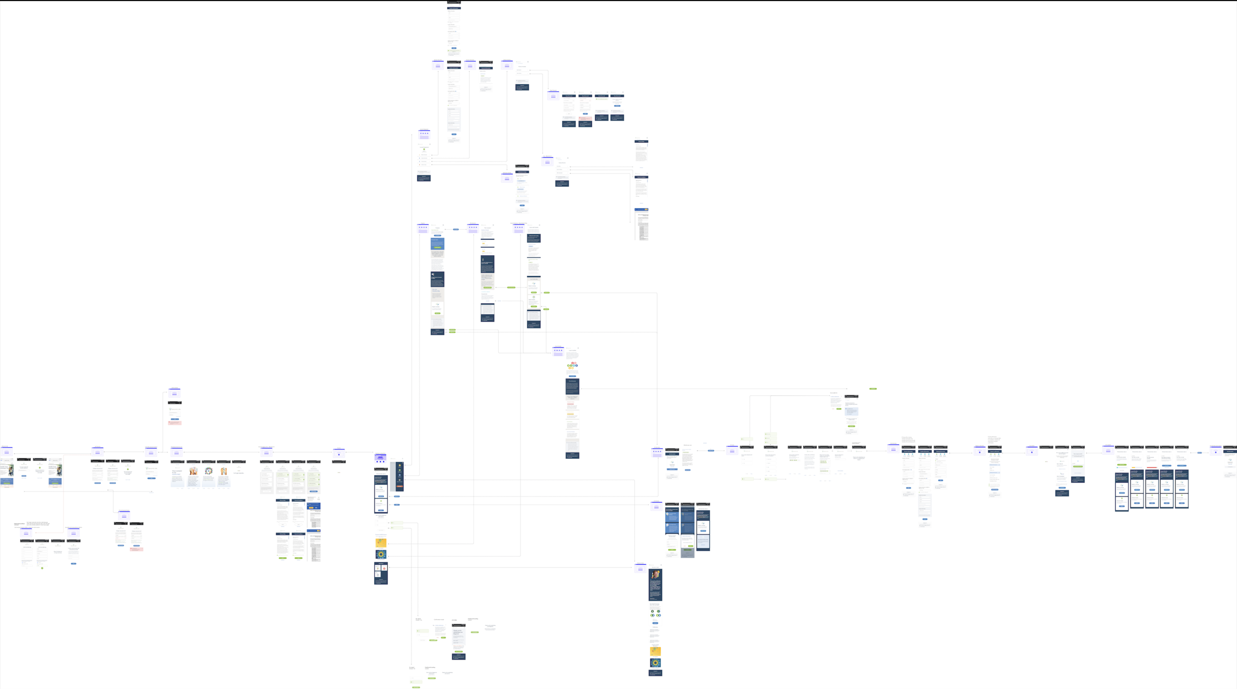
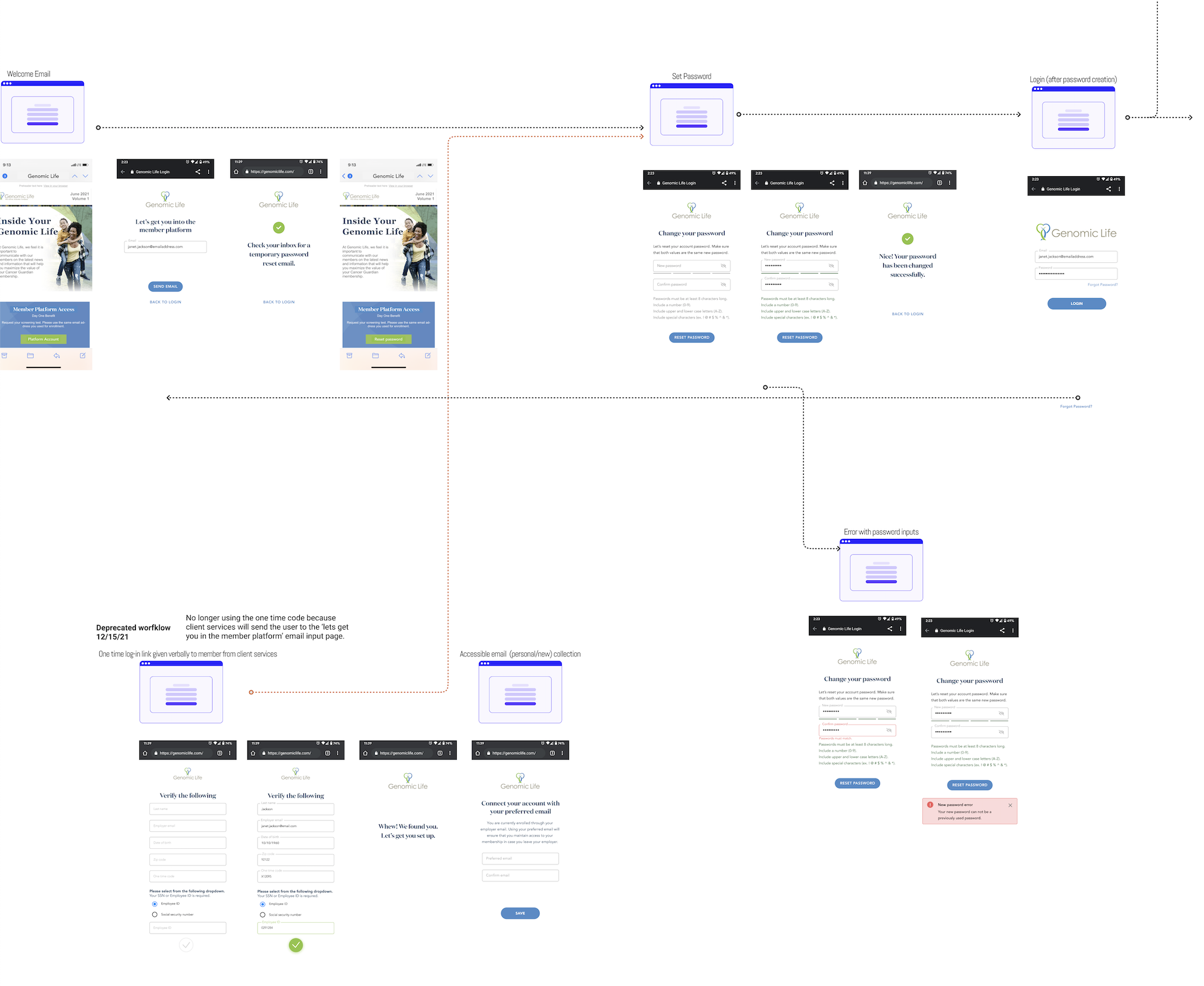
I worked with the team to map every entry point, not just the ideal one. Members could land in the platform through several different paths depending on data ingestion from their partner company. I documented all of them so the team could prioritize the highest-frequency cases rather than designing for a single "happy path" that wouldn't reflect real usage.
Zooming in & out of the experience
I started and maintained a full mapping of our mobile page workflows to manage edge cases and take inventory of workflows for stakeholder review. I used this as a source of truth during weekly review to uncover edge case gaps and differences in implementation.
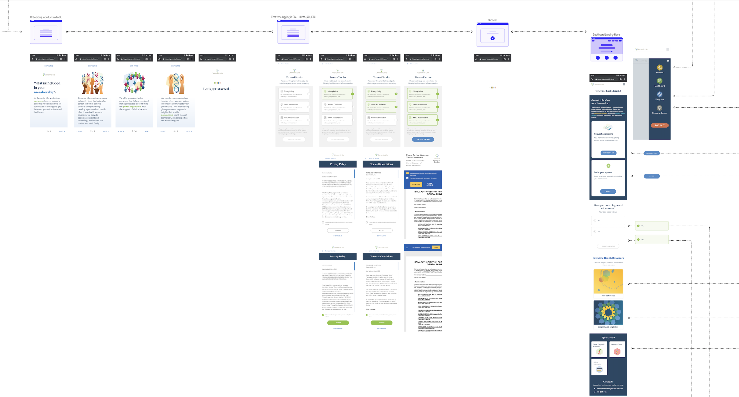
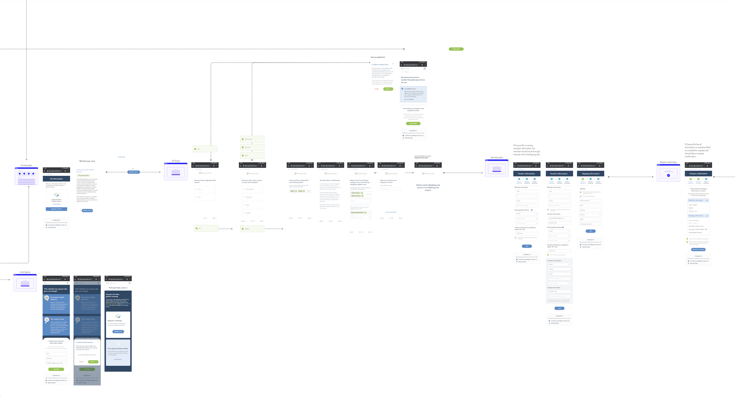
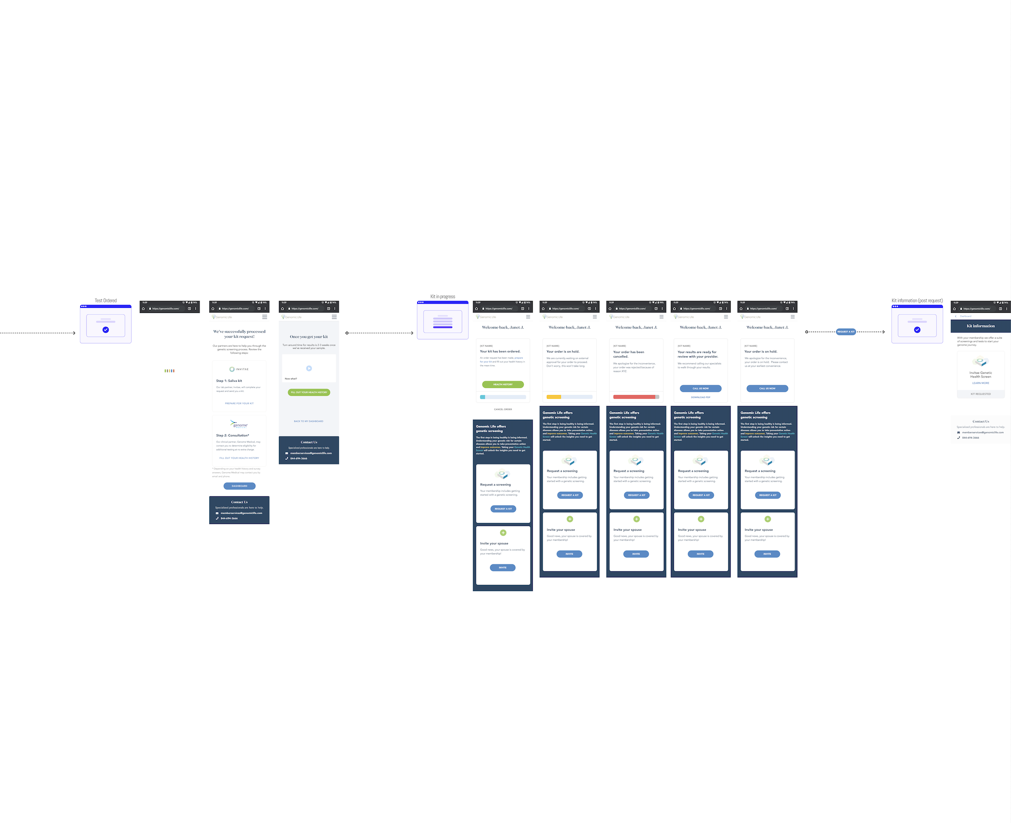
Education of dynamic offerings
Usability testing revealed a lack of understanding of products and services. Usability testing showed that offering multiple points for learning at different parts of the experience were a crucial part of the process. I observed more explorative behavior of content than direct actions like ordering a kit or inputting health information.
Introduction to services
I designed an educational carousel with friendly visuals as part of early stages of onboarding. During interviews, I collected qualitative data that the visuals made the service seem more approachable and the service language was approachable.
Product clarity in context
I discovered that even with one test type offering, users wanted to learn more about the contents of it, how to use it, and what it the outcome would mean for their health. I designed kit requesting as a step-by-step flow modeled on a standard checkout, built to scale toward supporting multiple kits and products even though only one was live at launch.
Diversifying informative content bites
Once a user accomplished a kit order, we encouraged the next steps by introducing immediate actions to take to prepare for their report. During usability testing, I gathered from 80% users that they were unsure what to do next.
Next step cards guided our users to continue engaging with services and it’s importance
Language clarifying health survey intake usage lowered the barrier to entry and prompted curiosity to see and complete the form
Email prompts to complete the form closed the loop for completion of idle forms
Results
Shipped Genomic Life's first member self-service platform in 6 months, replacing a fully phone-call-dependent process with a self-serve digital flow across desktop, tablet, and mobile.
Usability testing directly informed pre-launch changes to onboarding, login, and content. Catching friction before it reached real members instead of after.
Bumping up educational and informative content throughout the experience led to higher rates of kit ordering and 100% health survey completion for all ordered kits
What I'd do differently:
Research - Validation leaned heavily on the client services team's existing member relationships. With more runway, I'd want a broader, more structured recruiting process for usability testing rather than relying on one team's book of contacts.
Design - With additional product offerings, I would like to do design research on how offerings should be prioritized and highlighted in the user experience. I would test and iterate on custom recommendations and promoting the right offering to the most relevant user.