
Closing the gap between visit and value
Redesigning patient onboarding for a genetic testing portal.
Team
1 UI/UX Designer
2 Software Engineers
1 Data Scientist
1 Product Manager
My role
UI/UX Designer
Devices
Desktop & Mobile
Timeframe
14 months
PROJECT
At Invitae, I designed across three connected surfaces: a provider portal (used by physicians and clinic staff to order tests), a patient portal (used by patients to create accounts, track status, and view results), and internal tools that manage orders and results for operations staff.
GOAL
This case study focuses on a problem that lived at the seam between the provider and patient experiences: patients were reaching our site, but a very small fraction of them were completing the steps that got them real value, creating an account to complete an order or a view test results.
The problem, in numbers
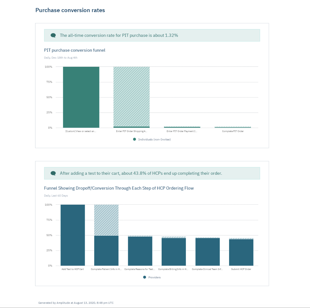
I worked with a data scientist to understand baseline metrics determining where the funnel was actually breaking. A few numbers reframed the problem for me:
The all-time conversion rate for a patient-initiated test purchase was 1.32%, across a four-step flow (start → shipping info → payment → complete order). The overwhelming majority of patients who started this flow never finished it.
By contrast, providers completed a structurally similar multi-step ordering flow at 43.8% — roughly 33 times the patient completion rate.
Reframing the design problem
Instead of treating this as one onboarding flow to fix, I reframed it a distinct problems, authentication drop-off. The data showed nearly a quarter of visitors never sign in at all, which suggests the first barrier to entry is the account-creation step. This distinction mattered because it meant the fix wasn’t more encouragement to sign up. It had to be structural: change what patients are asked to do and when.
Approach
I mapped the patient journey stage by stage. First patients are invited by their providers to create an account, next they view status and test results, and finally ongoing engagement. To get to the account, I focused on designing around the current behaviors of providers and patients.
Stage 1 — Provider orders the test
Provider action: Places order in provider portal, which should auto-generate a patient invite.
Pain point: If invite generation is an optional, easy-to-skip step, patients never get invited at all. The drop-off happens before the patient ever sees anything.
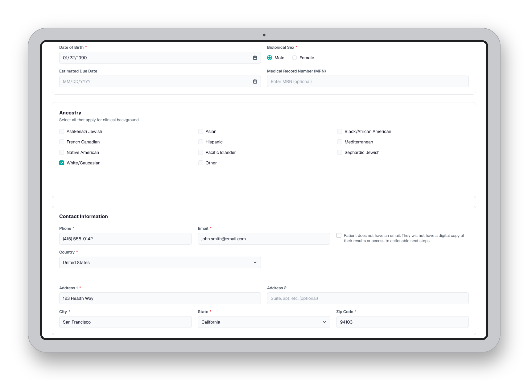
Design opportunity: Make patient invitation a default and visible part of the order-completion flow in the provider portal. I worked with development to determine required input fields, baking in the intention to generate a patient invite to the portal.
Stage 2 — Patient’s first value moment
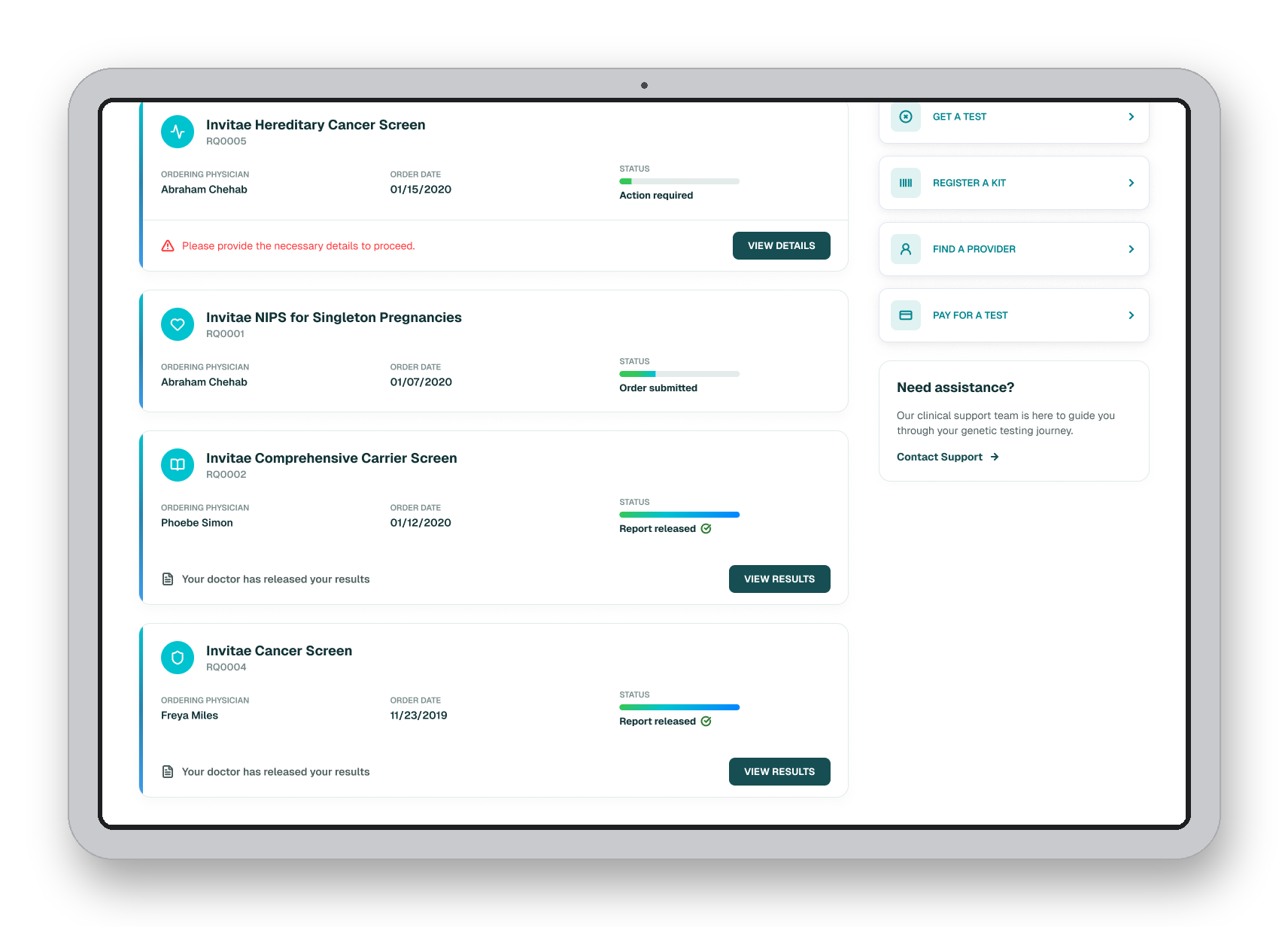
Patient action: Sees test status and a blocker to receiving their kit.
Pain point: Though patients came in to create the account, follow-up steps including filling out shipping, billing, or patient health information were all blockers that prevented them from reaching their goal.
Design opportunity: Design the first-value moment to guide users to complete their mission. I redesigned test order cards to include progress bars and informative text. This empowered our users, giving them context to unblock themselves while providing minimal sense of urgency.
Stage 3 — Admin visibility & ongoing engagement
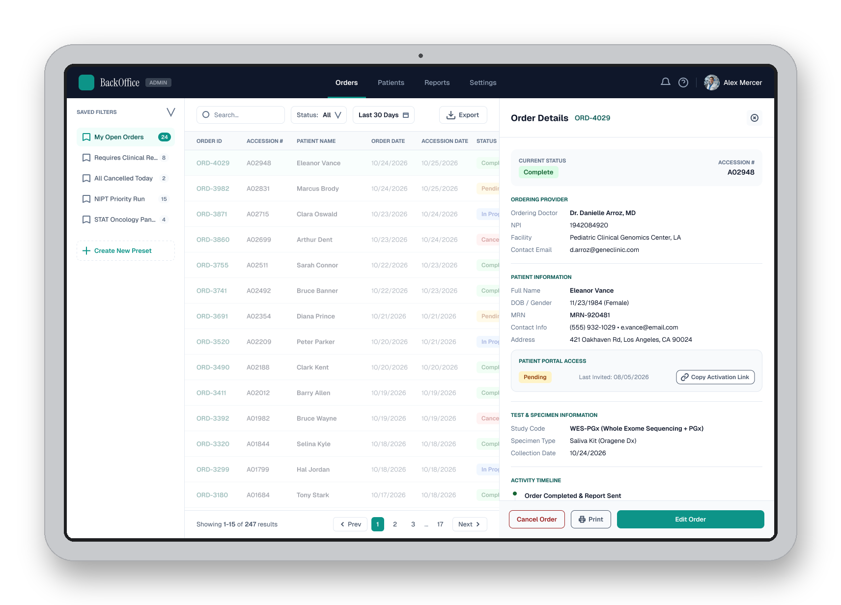
Provider/admin action: Providers and patients alike would call into the customer service teams at Invitae to ask where their test kits were. The internal admin team needed to verify which patients haven't activated their accounts in order to resend invitations to close the loop.
Pain point: There was a way to view in-active portal accounts, but most cases were prompted by a call. Unless provider’s were reaching out, visibility wasn’t there for the Invitae team to proactively act.
Design opportunity: Design a visible cue for internal members to identify opportunities to reengage patient members without an activated portal account.
results
After usability testing, we found most cases providers were neutral with required fields and felt most of them felt like it was common sense. Over time, required inputs generated friction with completion of ordering. We made an additional update to accommodate use cases where patients did not have an email. A checkbox to toggle off the required email input mitigated the edge cases that would block our providers from completing an order. The initial required field efforts cleaned up data and error, however there is room for improvement of this design.
Data analytics within the patient portal indicated that engagement with test cards increased by 24%. The redesign of the cards received positive feedback, but the importance of having content attached to a progress state clarified what next steps the patient needed to take to receive a kit or their results.
The internal BackOffice admin users were now capable of pulling reports that included data of patients missing valid emails, those who had or had not activated there accounts, and how long it was since the email was sent. Proactively sending the activation link to a provider ranged between 3 - 8 times a month according to our follow-up team member interviews, a visible change in their process and positive engagement with providers.